Monday, 4 January 2016

Module: NCI546 Character design evaluation


For this project I was asked to design a character with a fully detailed backstory, personality and produced in a style that would best suit it.

Before I began actual work on this module, I was given a task over the summer to produce a storyboard that would help portray a character. Seeing this as a good opportunity to continue with a sequel to my first comic and introduce a new villain, I once again chose one of my own personal characters of whom just required the correct matching style to bring him out.

My character is a mutated gorilla named Grill who became mutated by radiation from a mysterious crystal that didn’t originate on earth. Through my storyboard I portrayed him as a supposedly well meaning super smart gorilla who was willing to help humanity, until half way near the end he reveals his true colors as a sadistic villain who despises humanity due a traumatic childhood experience involving hunters. During a brief scuffle with the team of heroes he almost succeeds in his plan of setting off a bomb in a locked building filled with human hostages while he escapes through a glassed domed roof, however he underestimated the heroes, when Colm the frog used his elastic tongue to swing the bomb back towards him latching on to his right elbow.
Realizing he only had a few minutes left Grill was able to reset the bomb to a minimal blast, which destroyed half the building and his entire right arm. Miraculously he survived the explosion and escaped to a nearby scrapyard where he was approached by doctor Cheetah who offered to build him a new arm and a chance at revenge which he a agreed, swearing to get even with Colm. 

I can’t accurately remember where my original inspiration for Grill came from, but I mainly believe it came from watching Ape, an intelligent English speaking gorilla from the Disney film George of the jungle, as for the robotic arm I think I was inspired by Action Man villain known as Doctor X. Formerly I was just going to have the characters hand robotic, but changed my mind when my dad suggested it should be the whole right arm.
The reason why I call him Grill is because of after losing his right arm the top area of where his shoulder has scorched grilled burns.

To help find the correct style I wanted to produce my character with, I decided to look up similar character designs that have been used for animated TV series/films. For example since my character is a gorilla I have gathered a collection of inspiring characters such as Gorilla Grodd, Monsieur Mallah, Mojo Jojo, king Kong and Kerchak, along with others who have robotic limbs including Lightening Lad, John Silver, Clyde and Cyborg.
I have tried looking and producing styles outside the comfort zone but most of the styles that I came across in Pictoplasma didn’t feel right to portray my villainous no nonsense gorilla.

Apart from the traditional style that I mainly use for producing my characters I have also looked at the works of Pictoplasma artists such as Peter Thaler and Lars Denicke to help create other forms of my character in a new variety, even though most of them never appealed to my liking. Seeing that I wanted to make him look more like a realistic gorilla yet still have a little bit of a cartoonish look I settled on the style that was used by American animator Bruce W. Smith who used it for the Disney character know as Kerchak from film Tarzan. At first I was originally going to use Bruce Timm’s minimalist angular style that he used to produce the animated version of Gorilla Godd but felt that it didn’t quite go with the appearance I was going for. 

As for the arrangement of dynamic poses I had two techniques I used to help produce them there was copying poses from the hulk to display his super enhanced strength and two photos taken of myself for the sitting down position and the stance of shooting his machine gun.

For my final piece I produced an A2 model sheet with different poses, expressions, personality and biography of grill, along with a watermelon background to display his addiction for watermelons.

Overall I have found this module very interesting and challenging since it has allowed me to yet again bring forth another one of own personal characters creating him with the style that best portrays him and experimenting with variety of color tones for his hair. I hope to further progress these skills in similar future modules.

Development work

Illustrator designs


First attempt


Second attempt


Third attempt


Photoshop colour tests


Dynamic poses and facial expressions


Twice weekly report

Over these past two weeks I have been researching and experimenting on styles that would best suit my secondary villainous character known as grill the gorilla. I have looked in to the appearances of animated apes and cyborgs finding necessary requirements to form my character.


To help produce the storyboard I have looked into the buildings of Newcastle that have a glass domed roof that will be featured for Grills supposed escape. Out of all my options I have chosen the Jamie Oliver Italian restaurant located near Grey’s Monument since its exterior includes a domed roof.


I have also chosen the style that was used to produce the Disney character Kerchak from the 1999 film Tarzan along with editing him in Photoshop since I am more familiar with tools it offers.

SWOT analysis

  • Forming a character more accurately in illustrator with curves and shapes.
  • Producing dynamic poses for a change instead of just points of view.
  • Experimenting with different colour tones.
  • Could improve his appearance to make my work look more professional.


Character design research 

Peter Thaler and Lars Denicke


Peter Thaler and Lars Denicke are illustrators who are best known for their character designs that mainly include cute colorful small-deformed animals and bizarre looking creatures. With most of their characters some don’t actually have a mouth to express words, so the characters rely on their eyes to show their emotions this is what gives a few of them a cute appearance, along with the portrayal of alternative ways of communications e.g. facial expressions and body language since actions can sometimes speak louder than words.

I find both of their designs very bizarre and somewhat useful I could possibly use their style to make my character grill look more ugly while also giving his arms a more lanky appearance that could portray him as a more agile but also clumsy villain.


Bruce Timm


Bruce Timm is an American character designer/animator who is best known for his work in developing the styles of characters for the DC animated series Justice League and his own comic book series that involved designing new forms for heroes and villains such as Harley Quinn. I particularly like his style for the antagonist know as Gorilla Grodd, plus seeing that he is a villain I could use this to my advantage at portraying my character Grill in a similar fashion.

Gorillas and cyborgs reference imagery


Apart from Bruce Tim and other Pictoplasma illustrators I have searched through other character designs that somewhat related to the character I am planning to create, for example anthropomorphic gorillas and cartoonish cyborgs who have robotic implants yet still retain the organic body parts of their original self. 

  Disney's Ape and Action Man's Doctor. X


http://statici.behindthevoiceactors.com/behindthevoiceactors/_img/chars/char_54102.jpg
                                                 

DC Gorilla Grodd and monsieur Mallah


Power Puff girls Mojo Jojo


Disney Kerchak


kong the animated series


DC lightening Lad


Disney John Silver


Chris sands Clyde


DC Cyborg


Hello everyone Happy New Year! I know its been a canny while since i have posted recently new projects on here been a little too distracted, but anyway as a start off heres my first project for the second year accompanied by images of my development work that i have produced through the softwares i have used.

Monday, 11 May 2015

Year 1 Evaluation


End of the year reflection


I am going to reflect on the achievements, weaknesses and challenges I have had to face ever since I started this course.

Through every project I have worked on during this course, I have always had a handful of artists to help influence my work using their styles and techniques to produce multiple ideas of my characters.
For my first project I researched the history of animation stretching all the way back to the 19th century where the first projects were made to animate the separate frames creating the optical illusion effect which was originally created by Edward Muybridge. I learnt how the process of animation works by going through the 12 principles such as the storyboard, voice recording, synchronized animatic, design and timing, the layout, the actual animation, pencil tests, backgrounds, traditional ink-paint and camera digital ink and paint and finally computers and digital video cameras.
I have used Fawn Gehweilers big-eyed designs for my T-Rex, Photos of the exhibits from the Hancock museum combined with Christopher Hart’s cute anime style, a mixture of The Silhouettes appearance for animating my storyboard in Cinema 4D, Merging two characters such as Big Bird and Wilt to create my own character Flobby the stork and Charles Burns black and white gothic styled work for my three ghost sketches.
Through the numerous CAAD sessions I have attended I have been taught many ways on how to build a character and animate with multiple software programs such as Photoshop, Dragon frame, Illustrator and Cinema4D. I have found most of these programs very useful when editing a character but animating one has always been another challenging story.

I’ll admit I have had quite a few obstacles and weaknesses to face for when it came to a new software program. For example it has taken me a long while to get use to the hundreds of icons/tools that are used in Cinema4D going through every process of building a 3D character and learning how to animate it step by step has been a bit of a struggle for me to remember it all.
When I was first introduced to Cinema4D I was shown how to make a black image to be the background of the material I was going to experiment on and then merge it with a colourful version. At first it took me a while to remember which goes first but eventually got the hang of being able to upload objects more easily.
I was then taken through the process of how to animate a 2D character and a 3D character while using the key frame icon to record the body movements on to the timeline, I was given two choices of how I could animate a character either animate each of the body parts separately or place different frames on each other, then drag the poses while recording the movements which I found much more easy to use.
Another very challenging obstacle that I faced was rigging a 3D character’s skeleton especially for when it came to combing the joints together and keeping the bones from moving without the body parts. I believe with a little more practise I’ll be able to animate characters in Cinema4D more professionally.  

In future to help overcome these obstacles, I also plan to upload and produce more characters in Cinema4D and experiment with the animation process to both remember the steps of by heart, along with rigging the characters movements correctly so that they appear much better.
Seeing that I have used multiple illustrators styles in my work over the years, I am thinking about following my favourite chosen practitioners such as Georges Jeanty Mark Bagley, Bruce Timm and Eiichiro Oda to look up on their recent work to help further influence my own ideas. Last year I ended up producing a 22-page prototype comic book as part of my final showpiece that had been influenced by a number of six artists I had collected while researching.
Apart from them I have also been meaning to look into the styles of artists who have been able to transform a real life person into a cartoon version of themselves, I have used this technique before while try to put a character of mine in the comic.
To help further experiment with my own characters I believe more drawing practise is in order to find out which styles would best fit them along with achieving their perfect appearance.
I also plan to make more time for my projects since I have handed in some that were complete even though I had to leave out a few styles, ideas or textures I had planned to add to the artwork but couldn’t do so in time.

Over the summer I am planning to complete two projects to keep me busy and help further progress my skills. For my first project I will produce multiple concept ideas for my own personal characters to test out what style would best fit them. As I was saying before since I produced an amateur comic book, I am motivated to try and produce more volumes to test out multiple story plots and experiment more with the characters personalities, in fact to be fair I have imagined hundreds of characters since I was little it is just the matter of finding the correct design and style that is required to finalise their appearance. This will also help me break down several story plots I’ve been meaning to write up.
As for my second project I have been given a task to write up a script that is to be either a 30 seconds in length animation or to be a storyboard with 3 double paged spreads. It also has to have a character that needs to be realised in any sort of choice of media and that it can be formed from any of the seven basic plot types such as Voyage and return, rags to riches, the quest, comedy, tragedy, rebirth and overcoming the monster.

Once I have had a proper thought of what script I am going to base the plot on and which style would best be suited for it I shall begin work on this second project immediately.

Friday, 8 May 2015

Trip to berlin


During my last week abroad to Berlin i attended the Pictoplasma festival to view many different animated short films, along with listening to a few lecturers on their work. Personally i found half of the styles that people showed uninteresting to me none of their work was what i fancied, although there were actually a few with a good plot and graphics that really caught my attention such as this advert for a store where a bear has his first christmas instead of hibernating, i could tell straight away the the same texture was used for Disney's animated film Brother Bear.

There was also this colourful attractive 3D animation that was suppose to represent the moving cells within inside a human body even i myself and others in the audience saw it as a newborn who didn't love its mother and ended up imprinting on somebody who was more beautiful. 

Unfortunately due to taking a disposable camera with me and the photos are in the middle of being developed i am unable to upload any pictures on here for now. 

i wouldn't mind going back again next year to see what other new ideas the practitioners plan to show us.

Ghost story evaluation

NCI 402 Work Based learning

For this project i was asked to choose a ghost story and create three sketches from scenes based on their description in the form of my chosen practitioner.

I began by deciding on the third story A Tale of an Empty house which is based in the 19th century within a victorian era village centred around an estuary. the main plot of the story is about two men and their chauffeur who spend a few days in the area and come upon a what seems to be an abandoned old house until at night one of them gets strangled by a vengeful shadowy ghost-like figure. The ghost was originally an ugly short farm hand who was sentenced to death for the murder of killing the father of the woman he loved who had forbidden them from seeing each other. 
From reading most of the text i picked out three descriptions that i would use to create my sketches such as the dark figure was seen at the window, the girl ended up in an a asylum and the scene where the ghost strangles one of the men.


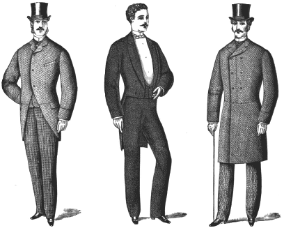
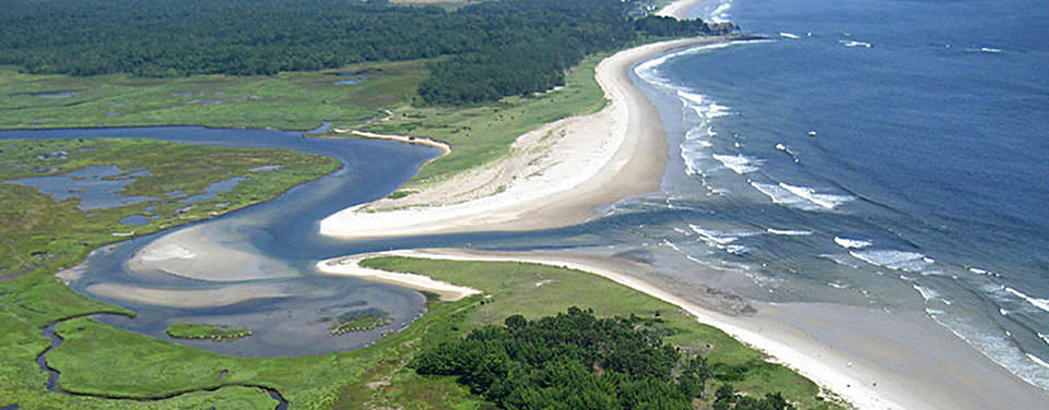
To help further add more reference to my work i did a little research on the setting and time of that era for example the environment of the estuary, the formal gentlemen fashion of the victorian age and ever since reading the cat like forehead description of the farm hands face i immediately had the thought of the vampires feline like feral face from Buffy the vampire slayer come to mind since it fits the image quite well.
Before i started working with a style i made a few rough fast sketches to work out where i was going to go from there.


Reference imagery


I was then given a list of artists to choose from and decide which style would best suit my ghost story, i ended up researching about 10 artists even though only four had caught my interest such as Martin Simpson, Chris King and Luke Newell. But the one who really inspired me was Charles burns artwork that looks very detailed and creepy to me, especially since he has the sexually transmitted disease known as gonorrhoea in his sketches to make some of his characters hideously revolting. Apart from that i have also tried using the similar line work for my girl characters hair to make it look unwashed and flowing after being in the asylum for so long. 
To make my shadowy character more menacing and evil i gave him a swirly flowing dark aura surrounding his whole body, plus as a bonus to make him seem more supernatural i filled in his eyes with a yellowish glow.
As for my strangling piece i was aided by a friend to take several photo shots of us strangling each other from different angles so that i could pick which one would be best suited for the final sketch, eventually i settled on the back of the head shot.

Martin Simpson


Chris King


Luke Newell


Charles Burns


Once all three sketches were complete i had them all uploaded and then edited on to photoshop, where i decided to fill them in with dark colours instead of going with the original idea of having them black and white. By looking at my final results not only do they look more colourful but they appear to have been brought in a more comic book themed style which i find unexpectedly interesting.


Final Pieces


Shadowy figure at the window

Girl staring out the window

Being strangled


Before completing my work i was given a little group exercise to work on where i had make a list of phobias and produce a sketch based of that fear, i ended up with Barophobia a phobia where someone is scared of falling or gravity in another case. So for that i drew a hairy coconut with stubby arms and legs flapping through the air, with wide opened eyes and a large screaming mouth falling from a great height.

Overall i have found this project both inspiring and fun especially when it came to producing the sketches i hope to do more conceptional ideas like this for future projects.


Swot analysis

  • Reference imagery collected, research could of used a little more detail.
  • Should of made more time to experiment more.
  • With the descriptive text been given i could given a job opportunity as a concept artist.