Monday, 11 May 2015

Year 1 Evaluation


End of the year reflection


I am going to reflect on the achievements, weaknesses and challenges I have had to face ever since I started this course.

Through every project I have worked on during this course, I have always had a handful of artists to help influence my work using their styles and techniques to produce multiple ideas of my characters.
For my first project I researched the history of animation stretching all the way back to the 19th century where the first projects were made to animate the separate frames creating the optical illusion effect which was originally created by Edward Muybridge. I learnt how the process of animation works by going through the 12 principles such as the storyboard, voice recording, synchronized animatic, design and timing, the layout, the actual animation, pencil tests, backgrounds, traditional ink-paint and camera digital ink and paint and finally computers and digital video cameras.
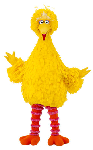
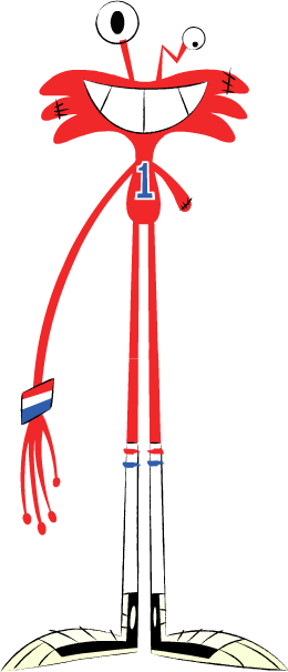
I have used Fawn Gehweilers big-eyed designs for my T-Rex, Photos of the exhibits from the Hancock museum combined with Christopher Hart’s cute anime style, a mixture of The Silhouettes appearance for animating my storyboard in Cinema 4D, Merging two characters such as Big Bird and Wilt to create my own character Flobby the stork and Charles Burns black and white gothic styled work for my three ghost sketches.
Through the numerous CAAD sessions I have attended I have been taught many ways on how to build a character and animate with multiple software programs such as Photoshop, Dragon frame, Illustrator and Cinema4D. I have found most of these programs very useful when editing a character but animating one has always been another challenging story.

I’ll admit I have had quite a few obstacles and weaknesses to face for when it came to a new software program. For example it has taken me a long while to get use to the hundreds of icons/tools that are used in Cinema4D going through every process of building a 3D character and learning how to animate it step by step has been a bit of a struggle for me to remember it all.
When I was first introduced to Cinema4D I was shown how to make a black image to be the background of the material I was going to experiment on and then merge it with a colourful version. At first it took me a while to remember which goes first but eventually got the hang of being able to upload objects more easily.
I was then taken through the process of how to animate a 2D character and a 3D character while using the key frame icon to record the body movements on to the timeline, I was given two choices of how I could animate a character either animate each of the body parts separately or place different frames on each other, then drag the poses while recording the movements which I found much more easy to use.
Another very challenging obstacle that I faced was rigging a 3D character’s skeleton especially for when it came to combing the joints together and keeping the bones from moving without the body parts. I believe with a little more practise I’ll be able to animate characters in Cinema4D more professionally.  

In future to help overcome these obstacles, I also plan to upload and produce more characters in Cinema4D and experiment with the animation process to both remember the steps of by heart, along with rigging the characters movements correctly so that they appear much better.
Seeing that I have used multiple illustrators styles in my work over the years, I am thinking about following my favourite chosen practitioners such as Georges Jeanty Mark Bagley, Bruce Timm and Eiichiro Oda to look up on their recent work to help further influence my own ideas. Last year I ended up producing a 22-page prototype comic book as part of my final showpiece that had been influenced by a number of six artists I had collected while researching.
Apart from them I have also been meaning to look into the styles of artists who have been able to transform a real life person into a cartoon version of themselves, I have used this technique before while try to put a character of mine in the comic.
To help further experiment with my own characters I believe more drawing practise is in order to find out which styles would best fit them along with achieving their perfect appearance.
I also plan to make more time for my projects since I have handed in some that were complete even though I had to leave out a few styles, ideas or textures I had planned to add to the artwork but couldn’t do so in time.

Over the summer I am planning to complete two projects to keep me busy and help further progress my skills. For my first project I will produce multiple concept ideas for my own personal characters to test out what style would best fit them. As I was saying before since I produced an amateur comic book, I am motivated to try and produce more volumes to test out multiple story plots and experiment more with the characters personalities, in fact to be fair I have imagined hundreds of characters since I was little it is just the matter of finding the correct design and style that is required to finalise their appearance. This will also help me break down several story plots I’ve been meaning to write up.
As for my second project I have been given a task to write up a script that is to be either a 30 seconds in length animation or to be a storyboard with 3 double paged spreads. It also has to have a character that needs to be realised in any sort of choice of media and that it can be formed from any of the seven basic plot types such as Voyage and return, rags to riches, the quest, comedy, tragedy, rebirth and overcoming the monster.

Once I have had a proper thought of what script I am going to base the plot on and which style would best be suited for it I shall begin work on this second project immediately.

Friday, 8 May 2015

Trip to berlin


During my last week abroad to Berlin i attended the Pictoplasma festival to view many different animated short films, along with listening to a few lecturers on their work. Personally i found half of the styles that people showed uninteresting to me none of their work was what i fancied, although there were actually a few with a good plot and graphics that really caught my attention such as this advert for a store where a bear has his first christmas instead of hibernating, i could tell straight away the the same texture was used for Disney's animated film Brother Bear.

There was also this colourful attractive 3D animation that was suppose to represent the moving cells within inside a human body even i myself and others in the audience saw it as a newborn who didn't love its mother and ended up imprinting on somebody who was more beautiful. 

Unfortunately due to taking a disposable camera with me and the photos are in the middle of being developed i am unable to upload any pictures on here for now. 

i wouldn't mind going back again next year to see what other new ideas the practitioners plan to show us.

Ghost story evaluation

NCI 402 Work Based learning

For this project i was asked to choose a ghost story and create three sketches from scenes based on their description in the form of my chosen practitioner.

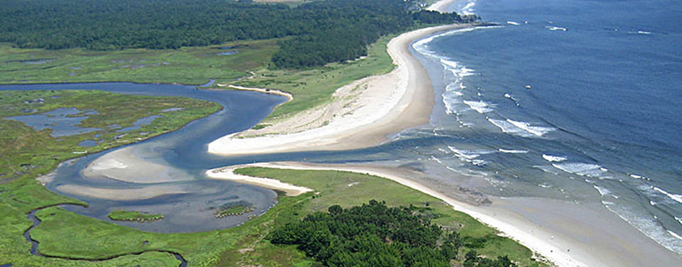
I began by deciding on the third story A Tale of an Empty house which is based in the 19th century within a victorian era village centred around an estuary. the main plot of the story is about two men and their chauffeur who spend a few days in the area and come upon a what seems to be an abandoned old house until at night one of them gets strangled by a vengeful shadowy ghost-like figure. The ghost was originally an ugly short farm hand who was sentenced to death for the murder of killing the father of the woman he loved who had forbidden them from seeing each other. 
From reading most of the text i picked out three descriptions that i would use to create my sketches such as the dark figure was seen at the window, the girl ended up in an a asylum and the scene where the ghost strangles one of the men.


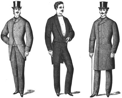
To help further add more reference to my work i did a little research on the setting and time of that era for example the environment of the estuary, the formal gentlemen fashion of the victorian age and ever since reading the cat like forehead description of the farm hands face i immediately had the thought of the vampires feline like feral face from Buffy the vampire slayer come to mind since it fits the image quite well.
Before i started working with a style i made a few rough fast sketches to work out where i was going to go from there.


Reference imagery


I was then given a list of artists to choose from and decide which style would best suit my ghost story, i ended up researching about 10 artists even though only four had caught my interest such as Martin Simpson, Chris King and Luke Newell. But the one who really inspired me was Charles burns artwork that looks very detailed and creepy to me, especially since he has the sexually transmitted disease known as gonorrhoea in his sketches to make some of his characters hideously revolting. Apart from that i have also tried using the similar line work for my girl characters hair to make it look unwashed and flowing after being in the asylum for so long. 
To make my shadowy character more menacing and evil i gave him a swirly flowing dark aura surrounding his whole body, plus as a bonus to make him seem more supernatural i filled in his eyes with a yellowish glow.
As for my strangling piece i was aided by a friend to take several photo shots of us strangling each other from different angles so that i could pick which one would be best suited for the final sketch, eventually i settled on the back of the head shot.

Martin Simpson


Chris King


Luke Newell


Charles Burns


Once all three sketches were complete i had them all uploaded and then edited on to photoshop, where i decided to fill them in with dark colours instead of going with the original idea of having them black and white. By looking at my final results not only do they look more colourful but they appear to have been brought in a more comic book themed style which i find unexpectedly interesting.


Final Pieces


Shadowy figure at the window

Girl staring out the window

Being strangled


Before completing my work i was given a little group exercise to work on where i had make a list of phobias and produce a sketch based of that fear, i ended up with Barophobia a phobia where someone is scared of falling or gravity in another case. So for that i drew a hairy coconut with stubby arms and legs flapping through the air, with wide opened eyes and a large screaming mouth falling from a great height.

Overall i have found this project both inspiring and fun especially when it came to producing the sketches i hope to do more conceptional ideas like this for future projects.


Swot analysis

  • Reference imagery collected, research could of used a little more detail.
  • Should of made more time to experiment more.
  • With the descriptive text been given i could given a job opportunity as a concept artist.

Artists who have inspired me


Fawn Gehweiler 

Fawn Gehweiler is an American artist who is best known for her cute character designs for fashion and entertainment industries. It is thanks to her style that inspired me to sketch big-eyed lanky yet cute similar characters, such as dinosaurs and a small boy.  

When it comes to producing her work Gehweiler mainly offers her designs for art based advertisements and consumer goods, but has also produced illustrations for magazines, website homepages and posters. For example there's “Lullie Vintage” featuring a group of colorful girls surrounding a sign post to attract customers for shopping, “Moshi Moshi Japan” featuring two girls on the telephone that advertises American art goods and a mini exhibition in Australia called “Little Lost and Innocent” that represents a cute young girl and baby deer which Gehweiler describes as “celebrating dolly birds, bubblegum and girlish fantasies.  


Christopher hart/ Hancock museum trip

When I took a trip to the Hancock museum I came across a few exhibits that became the main conception for my storyboard project especially this colourful patchwork elephant named Phillip the flip-flop elephant. Along with that I also included a zebra, an ostrich, a T.rex, an Iguanadon, an Egyptian mummy, an archaeopteryx, a velcociraptor, a hunter and a witch doctor as all part of my separate scripts. I eventually settled on my elephant idea and decided to use Christopher Harts anime themed style to make my animal characters appear young and cute so that the audience can tell that they are children.
I came across this style while looking up Hart in his book the Draw manga now! Super cute animals and pets, where he has detailed about how to sketch a baby animal in the form of manga step by step.


The Silhouettes/ kiko and the hand

When it was time for me to animate my storyboard I was given a list of videos to choose from that could help influence my work. After looking through so many ideas I eventually settled with the silhouettes, which has alien characters shaped in a circular ball shaped style. This is what gave me the push to change my characters appearance so that it would be easier to animate them along with a suggestion from my tutor to make them look goofier. As for kiko and the hand my original idea for that was to use the hands moving rainbow patterns to make the patterns on my elephant character manoeuvre but didn’t have enough time to complete it.


Big bird and wilt

Ever since I was young I have always had the wild imagination to produce hundreds of characters one in particular is Flobby the stork who I originally conceived from two television characters from separate children shows I use to watch when I was little such as Big Bird from Sesame Street and Wilt from fosters home for imaginary friends. 


Edward Muybridge 

Eadweard Muybridge was an English photographer who was best known for his work in the development of photography studies in motion and the earliest motion picture in projection. It was during that time that he became well known for his pioneering work in animal/human figure locomotion, where he used multiple cameras to capture the movements of the animal/human in stop motion photographs.

Another success that Muybridge is famous for is his photos of the wilderness of Yosemite especially Vernal Falls, the surroundings of San Francisco and the collection of separate photo frames of Sallie Gardner at a Gallop, which became one of the first ever motion pictures to be animated. He achieved this by planting a series of glass-plated cameras around the horse race track, which were then set off by attached thread that the passing horse ran over, capturing every separate image. Just like the previous scopes Muybridge copied the original images onto his very own Zoopraxiscope in the form of black silhouettes.


Jeff soto 

Jeff soto is an American contemporary artist who is best known for his Pop and street art projects. I find his designs very bizarre and yet attractive through the combination of bright and dark tones of the colour, while merging creatures together with nature such as his giant monster, floating island skull with antlers and his small blue fur ball creature handling art equipment.

With his designs I saw it as way to help influence my African animals to be merged with an element that could be related to them. For example there was either the ostrich being made out of electricity or air since it can run very fast, the elephant could of been made out of rock since it has a very tough hide and that its skin tone resembles a boulder and the zebra could of been made out of tall grass since its stripes could help blend in with its surroundings.  


By looking at his work it looks like he has used a collection of water colours to reveal the areas that are light and dark making them look attractive.


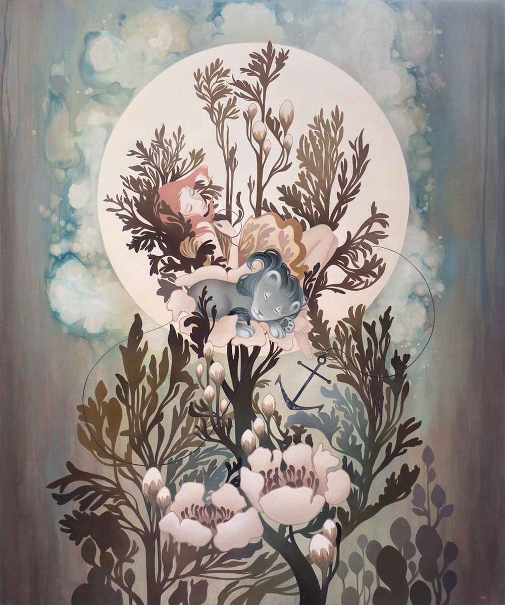
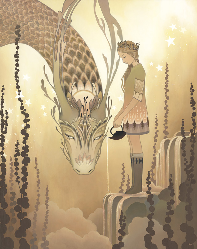
Amy sol 

Amy sol is an American artist who is best known for her pop surreal paintings. She uses a technique that involves painting on a treated wooden panel and inserting grain of the wood into the art piece. Many people say that her style combines both “figurative and narrative styles into something magical.”

Amy says that the wood is the real source behind her work, helping her to keep her hand in motion while allowing her hand to go with the flow. “When at the wood grain at times, it feels like you can sense it is alive, staring right back at you. Even though it was alive once, the imprint of it still exists influencing the colours to keep art natural.”

In most of her works, Amy has created a young girl with in a dream like nature world, surrounded by large or miniature fantasy themed animals. In many ways the theme is a bit similar to Alice in wonderland from the changing sizes to certain areas of the world. By looking at how the girl interacts with the animals, suggests that they are spiritually connected or know each other either as pet and mistress, friends or as a next incarnation. However nobody really knows and are left to guess, since Amy hasn’t really given a statement of the interaction. 

Once again I could of possibly used her style to make my animal characters look cuter and more dream-like; I could of even made the surrounding environment look more fantasy themed.  


Jeremy fish

Jeremy fish is an illustrator who is best known for his bizarre looking combinations of animals, building structures, vehicles and weapons. I particularly like his animal and weapons hybrids, either having an animal to represent what weapon it is related to or how the animals shape is much similar to the structure such as the sloth gun.

Once again I could of possibly used this style for my own African animal characters, for example Phillip the elephant could of been a cannon or tank since his trunk and huge body closely resemble them, Oz the ostrich could of been a crane thanks to his head and stripes the zebra could of been a grenade since many army weapons have camouflage patterns and a zebra’s stripes help it blend in with its surroundings.


Charles burns

Charles burns is an American cartoonist illustrator who is best known for his black and white gross comic book series Black Hole. His main influence for his artwork came from the front cover of a music album known as Fever Ray that was produced by Martin Anders. Along with this style Burns used the disgusting appearance of gonorrhoea to make his characters look more hideous. 

Apart from his own series Burns has also worked for other companies such as Sub Pop that produces multiple album covers for various music bands and RAW Magazine which during the 1980s was part of the alternative comics movement that became main focus of other plots other the super hero comics and also allowed new genres, artwork, styles and subjects to be introduced. 


I particularly like this style because of its dark tones combined with its disfigured features, which has worked perfectly with my chosen ghost story, giving my shadowy ghost figure a slightly ugly face, along with using the line work for my girl characters hairstyle